Search Engine Optimization
and Promotion
Website
To Increase Traffic and Conversions
Manager will contact you within 15 minutes of submitting your application and explain the details to you
Manager will contact you within 15 minutes of submitting your application and explain the details to you
We specialize in promoting
your business with an emphasis on learning more
about your web project and saving you money
SEO
A full cycle of website performance improvement: increasing traffic and conversion rates, enhancing usability and website quality in general
Order serviceExpert Audit
Checking the quality of optimization of a website in search engines and compiling a checklist for fixing bugs that impede effective SEO initiatives
Order serviceContextual Advertising
Setting up contextual advertising to boost systematic sales and calculating the payback period for advertising campaigns
Order serviceSEO Contractor Review
SEO contractor reviewing the quality of work done on search engine optimization of your website
Order serviceTaking Website Out of Filters
Prompt identification of reasons for website incurring sanctions and subsequent elimination of them
Order serviceUsability Adjustments
Checking the website for usability and identifying bottlenecks using Eye-tracking technology
Order service«Starter»
Promotion of websites belonging to family businesses operating in a niche with low competition. Suitable for businesses that are just taking their first steps in the online environment.
From $1 500
«Domestic»
Suitable for most businesses in the active online promotion phase and with their unique niche in a single subject area.
From $2 000
«Maximum»
Suitable for e-commerce and corporate websites with online product catalogues operating in a highly competitive environment. It is an excellent choice for large sites and projects with high growth prospects.
Starting at $3 000
SUBMIT YOUR APPLICATION
We will study your project in detail, identify all the subtleties and pitfalls and form an effective plan for the development of your company with minimal investment.

We have a track record of 1,200+ successful projects with many satisfied customers
Our highest turnover cases at a glance.
Free comparative website audit for those who ordered website promotion service. Duration of audit: from 5 working days
Always in touch
You will not feel that we are working remotely, as we are always with you.
Prioritize quality over quantity
One specialist accompanies no more than two projects. You are very important to us
Professional approach
Constant reporting to the client and support. We are for an individual approach with deep analysis. We are always open to your ideas.
Flexibility
We help you design, test, build and deliver products faster and at a lower cost.
Only 100% "white" methods
We use only 100% "white" methods, without the risk of falling under sanctions.
We are active
We are always ready to take part in social projects. If you have ideas for our social development, which can help in the development of local residents, then we will be happy to help you with this.


A comprehensive audit of your website
Plus, the first month of
promoting your web project
Offer expires in:
00
days
00
hours
00
minutes
00
seconds
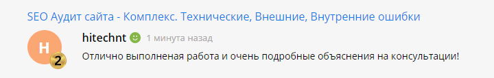
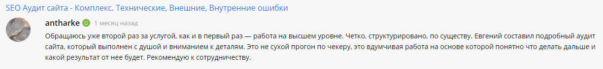
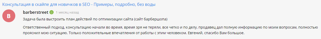
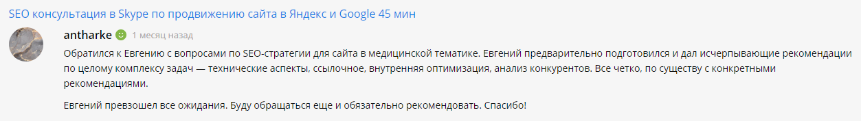
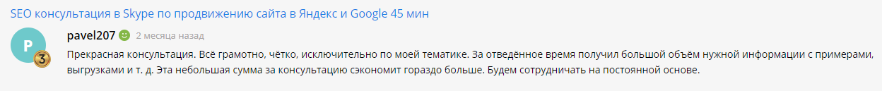
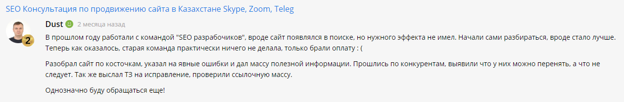
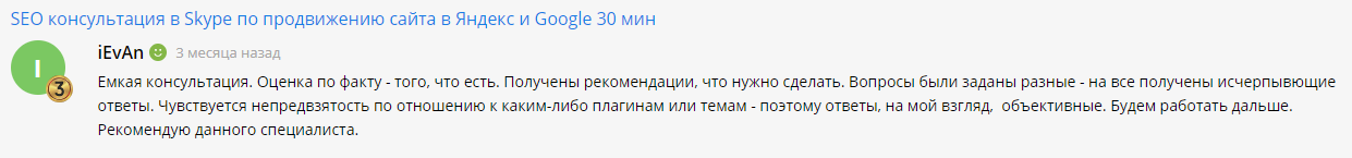
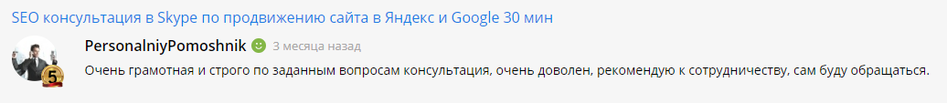
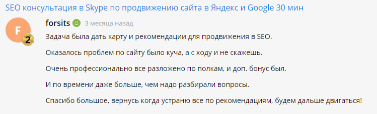
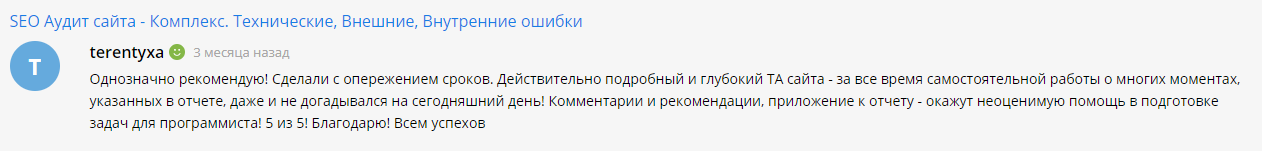
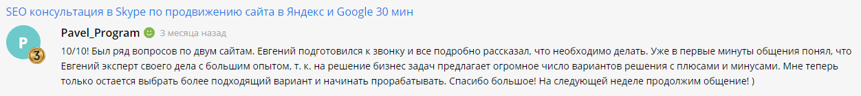
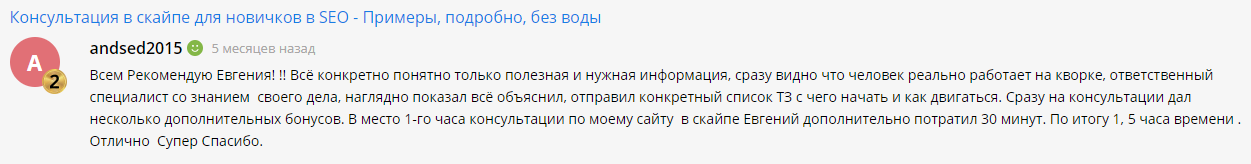
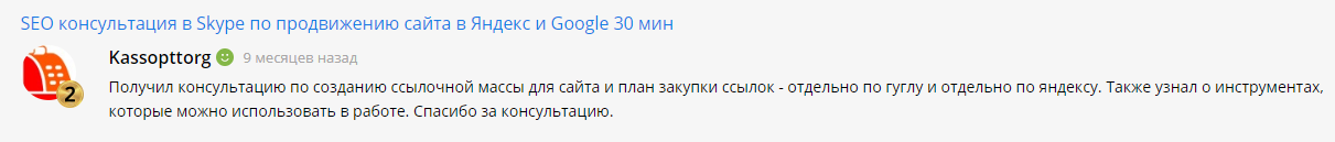
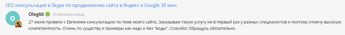
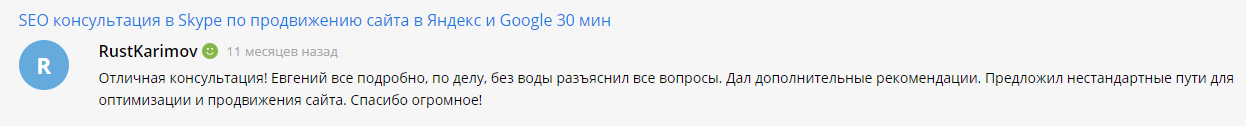
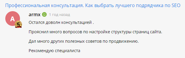
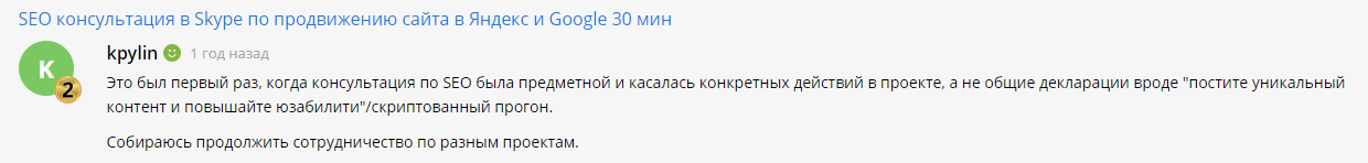
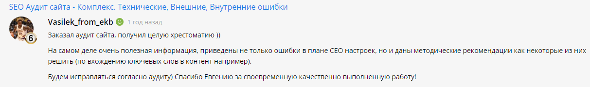
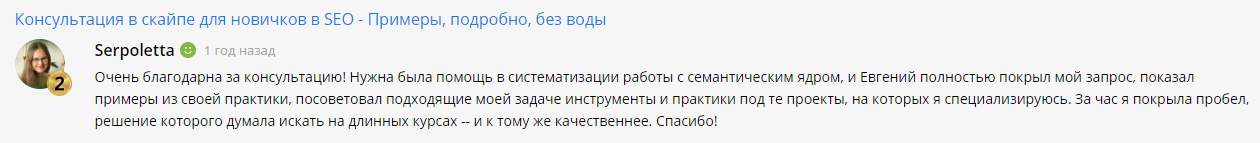
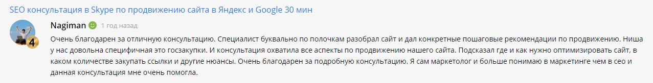
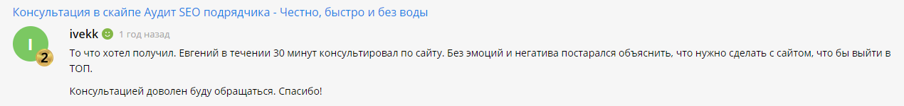
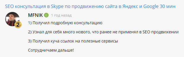
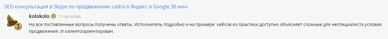
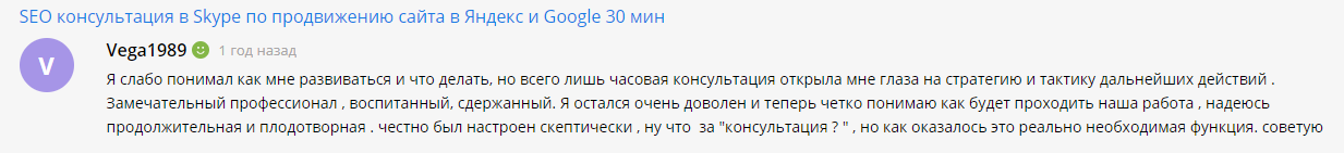
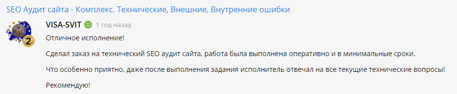
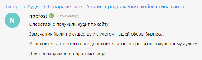
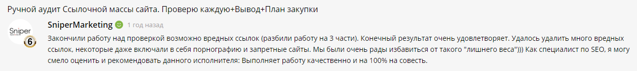
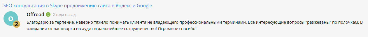
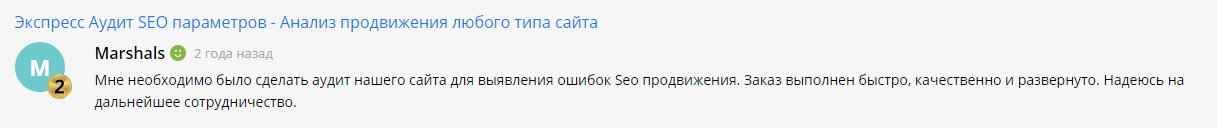
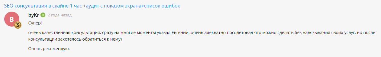
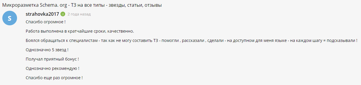
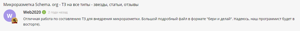
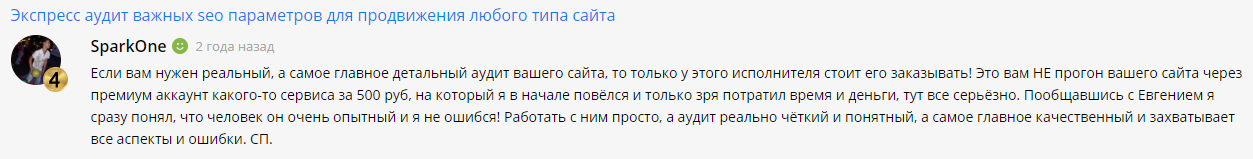
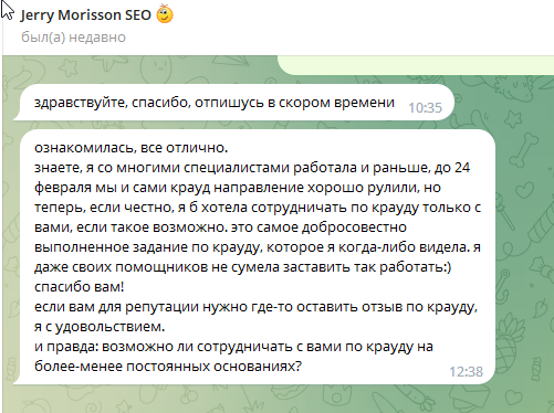
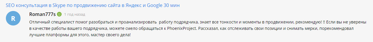
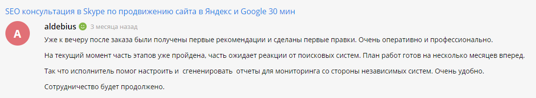
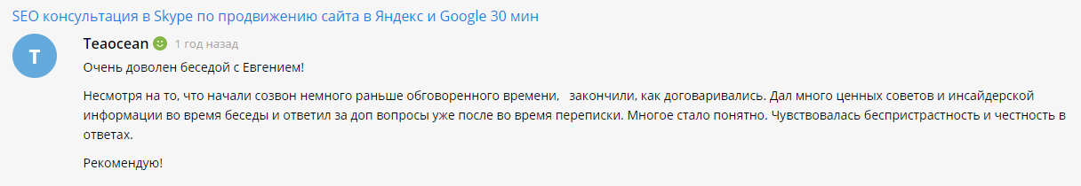
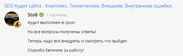
Here are some customer testimonials about our company


Smart Payment - a 5% discount. The discount is available to customers who have paid for our work at a rate of 3 months or more in advance. The discount is available to any client of our company.
The right choice - 7% discount. For our new customers, upon signing the contract no later than 10 days from the date of receipt of the commercial offer.
Change of contractor - 10% discount. Do you want to become our client and leave another company? Then we have good news, you will get a 10% discount. Available to new clients.
Favorable cooperation - 15% discount. You know how to make decisions quickly and are ready to pay in advance - keep a discount of 15%. Combination of discounts SMART PAYMENT and RIGHT CHOICE, 5% + 7% = 15% !!! Available to new clients.
Exclusive - 30% discount. If you want such a discount, call +38(068)976-73-31. The second option is to get a 30% discount to become a client with a budget of more than $2500
We appreciate your sense of humor :-) However, everything is possible, call us at +38(068)976-73-31 or leave a request, maybe you will advance for free until you get the results. We have several such satisfied clients in our portfolio.

What is the primary focus of PhoenixProject's services?
PhoenixProject's primary focus is on the development, maintenance, and comprehensive promotion of websites for its clients.
How does PhoenixProject approach the development of websites for its clients?
PhoenixProject takes a client-centric approach, working closely with clients to understand their unique needs and goals, and then designing and developing custom websites tailored to those requirements.
What types of maintenance services does PhoenixProject offer for websites?
PhoenixProject offers a range of maintenance services, including regular updates, security checks, content management, and technical support to ensure websites run smoothly and securely.
Can you elaborate on the comprehensive promotion services provided by PhoenixProject?
PhoenixProject's comprehensive promotion services encompass SEO optimization, social media marketing, pay-per-click advertising, and other strategies to enhance a website's visibility and attract targeted traffic.
How does PhoenixProject differentiate itself from competitors in the web development industry?
PhoenixProject distinguishes itself through its commitment to client satisfaction, attention to detail, and a holistic approach that covers every aspect of a website's lifecycle, from development to ongoing maintenance and promotion.
Phoenix Project 2015-
2024
Website promotion and creation